The creation process for this was one I had not anticipated to be as fiddly as it was. I had decided I wanted to show British ska by having the Union Jack flag linked with the two-tone idea of previous ska bands. Though it is not necessarily an image used by The Skints, it does connote many British ska bands such as The Specials & Madness. Below is the image I started with.

From here on I created a simple black-white two tone image, and layed this over the top, changing the blending options to overlay. Unfortunately, this did not give the original effect I had hoped. So, I decided from that to see if I could use the pieces of the two-tone image and jumble the flag up, as if it were a puzzle, but still keep the Union Jack recognisable. Once I had rearranged the flag sufficiently, I overlayed The Skints' iconic penny logo, featured on much of their artwork, onto the centre of the flag. Originally this blended in much more than I had hoped, so I filled the centre the centre with black to help show the penny details. With a few more contrast and brightness edits and the addition to bars and a stroke to the image, I ended up with the image below.
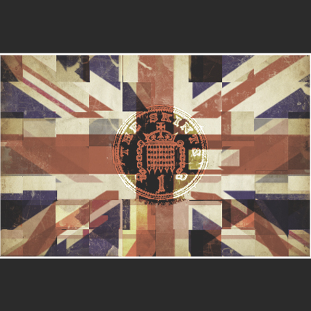
This, though my first image, was a piece I was rather pleased with. The jumbled two-tone idea leads to the idea of a new wave of British ska, which The Skints and affiliated bands such as Random Hand are bringing about. The penny in the middle shows it is not about the money, keeping it all to a minimum. This will relate to their audiences who know that their gigs and albums are always kept as low as possible in terms in pricing, but never quality. Generally, the cover has a very nice feel to it.
No comments:
Post a Comment