Tuesday 12 April 2011
Sunday 10 April 2011
Saturday 9 April 2011
Magazine advert
After finishing my single artwork, I moved onto creating an advert which would be featured in a magazine advertising the single.
I wanted to keep the magazine advert related to the cover, but I also felt that it was a chance to link the original album to the new single. Therefore, I decided to stick with the urban look but with a feel similar to the original album artwork, in that certain colours and texts hold a slightly regal feel.
When looking for some inspirational pieces, I found myself trying different searches into Google to bring up some advert ideas. I found myself Googling 'music magazine poster', which is when I got my idea.
I wanted to keep the idea simple so that the message was put across swiftly, which is what adverts are generally meant to do. Therefore, I kept the poster fairly plain and simple, which also kept in line with the raw feel I went for with my single artwork. To do this, I used a rough brick wall as the backdrop, and roughed the paper edges using downloaded grunge brushes as an eraser. I also took time to choose my font carefully, so that it would be a relatively formal font which had been 'grunged' up. I created a faded look on the paper by turning the opacity down on most layers, so that everything layered into each other nicely. Below is the finished product.

Friday 8 April 2011
Completed single artwork piece
I am pleased with the raw London look I have achieved with my single cover. The Skints are nothing but what they are, and don't pretend to be anything more. I feel this base feel has come through in my single artwork designs.

Single artwork back
After careful choosing and peer research, I decided to stick with my 3rd design of the single cover, which showed The Skints band name and single name on the London street sign post. Following this theme, I decided it would be an interesting idea to different kind of London street sign to incorporate the 3 track names for the single. Below is the original image I begun with.


The first thing to do was edit out the names. By using the clone stamp tool in Photoshop, this was nice and easy to do. I noticed the font was close to Times New Roman, so I colour picked the original text, and played with some blending options to make the text look realistic. Originally I expected to do the bevel option, but this didn't bring out the effect I had hoped, so I used a close drop shadow and changed the opacity of the text layers to blend into the background.
Next I decided I didn't like the building on the left, so I cloned that out. After finishing touches to make it look realistic, such as bar codes and copyrights, I finished with the image below.

Thursday 7 April 2011
Single artwork designs
Below are three cover designs that I conjured up by using iconic features I had decided that I would attempt to incorporate previously.


Single artwork creation process - 2
As a completely different idea from the other, I decided to bring an edit to a real-world image which would draw upon urban roots. By starting off with a London street sign, by patching over the original text using the colour picker and then finding the correct font which matched the original text, I reinvented what was written on the street sign. The only difficult part of making this was adjusting the proportions of the text to make them fit in with the angle of the photography. However, as I feel I am adept in Photoshop, this did not take long to master.
This image includes the single title of "Born in East London", which is a lyric from the song 'Up Against The Wall'. This works both ways - 'Born in East London' is linked to the image by using the postcode E4, which anyone who knows much about London will know that it is the postcode for the general area. After a small amount of research, I narrowed down E postcodes to E4, which I believe is where The Skints' band members were raised. In a more literal sense, this sign is 'Up Against The Wall'. The black bars frame the sign, which focuses the concentration onto the band. The final image is below.

This image includes the single title of "Born in East London", which is a lyric from the song 'Up Against The Wall'. This works both ways - 'Born in East London' is linked to the image by using the postcode E4, which anyone who knows much about London will know that it is the postcode for the general area. After a small amount of research, I narrowed down E postcodes to E4, which I believe is where The Skints' band members were raised. In a more literal sense, this sign is 'Up Against The Wall'. The black bars frame the sign, which focuses the concentration onto the band. The final image is below.
Single artwork creation process - 1
The creation process for this was one I had not anticipated to be as fiddly as it was. I had decided I wanted to show British ska by having the Union Jack flag linked with the two-tone idea of previous ska bands. Though it is not necessarily an image used by The Skints, it does connote many British ska bands such as The Specials & Madness. Below is the image I started with.

From here on I created a simple black-white two tone image, and layed this over the top, changing the blending options to overlay. Unfortunately, this did not give the original effect I had hoped. So, I decided from that to see if I could use the pieces of the two-tone image and jumble the flag up, as if it were a puzzle, but still keep the Union Jack recognisable. Once I had rearranged the flag sufficiently, I overlayed The Skints' iconic penny logo, featured on much of their artwork, onto the centre of the flag. Originally this blended in much more than I had hoped, so I filled the centre the centre with black to help show the penny details. With a few more contrast and brightness edits and the addition to bars and a stroke to the image, I ended up with the image below.
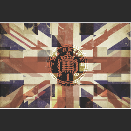
This, though my first image, was a piece I was rather pleased with. The jumbled two-tone idea leads to the idea of a new wave of British ska, which The Skints and affiliated bands such as Random Hand are bringing about. The penny in the middle shows it is not about the money, keeping it all to a minimum. This will relate to their audiences who know that their gigs and albums are always kept as low as possible in terms in pricing, but never quality. Generally, the cover has a very nice feel to it.
Single artwork thought process
The first things I needed to do in the process of creating my single cover was what it would feature. For each idea, I wanted to make sure I incorporated the band name, however not necessarily an single name. As for opening ideas, it is easier to keep the single name out of it, which allows me to keep more ideas included if it doesn't have to relate to the single name just yet.
I wanted to include items which would relate to The Skints location; East London, Britain. This included urban streets, the Union Jack, the London Underground sign, postcode features, street signs etc.
I also had to make a decision whether to have the single artwork as a political message, or simply a piece of eye-candy. The Skints' previous album cover for Live, Breathe, Build, Believe was somewhere in between in aesthetics. The cover had a slightly dark look, yet the message was simple and certain 'cartoony' features kept it balanced. The message is reteaching people how to live care-free. The cover is below.
I have always felt at home with Photoshop, and have been known to create music artwork as a pass time, so I am looking forward to engaging myself with an effective piece of single artwork.
Final effects over the music video
After finishing editing, the final part of the video needed was to use colour correction and various effects on the video. After viewing a few music videos, I came across a video which distinguished camera angles by different colour effects applied to them. The video, on one certain camera angle, applies a black and white effect. This, as a simple effect, seems to make quite a difference. We are planning to use this for one of the camera angles used throughout the gig footage of our video. I have embedded the video below.
Similarly, in this video, the audio at the end goes from the studio recorded music to the live performance with the crowd at the end. We took on board this interesting edit, and have used the same transition to the audience cheering from the studio music at the end in our music video.
Similarly, in this video, the audio at the end goes from the studio recorded music to the live performance with the crowd at the end. We took on board this interesting edit, and have used the same transition to the audience cheering from the studio music at the end in our music video.
Wednesday 6 April 2011
Editing process
After a long and grueling series of complications, our editing of our music video is almost complete. As my concentration has been fully on the editing process, my blogging of editing has slowed down.
We ran into a number of problems, which we have eventually overcome, which include:
We ran into a number of problems, which we have eventually overcome, which include:
- File format - our video format was a file type which meant that Final Cut Express would make us have to render each piece of footage over and over every time any sort of change was made. For the first few weeks, we only got a very tiny amount edited due to having to re-render every time we made a change. Eventually we found a format we could convert all of our clips into so that we would not have to render. Though at first converting all the videos was time-consuming, after that we had a much easier time editing, with the ability to micro-manage timing.
- Space - our high-definition footage was very large in space, and our amount of clips we ended up with filled up the hard drive completely on our editing Mac. To tackle this, we originally started deleting the clips which we had simply put in a folder labelled 'Unusable'. After that, we realised much of our footage had duplicates, due to the unconverted footage still on the hard drive. Deleting every clip which we had already converted freed up almost 60 gigabytes of space, which conquered our problem.
- General filming problems - these include not all people being able to make filming dates, weather problems for continuity, filled space on the SD cards during filming days, location availability.
Subscribe to:
Posts (Atom)