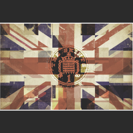
I am pleased with the raw London look I have achieved with my single cover. The Skints are nothing but what they are, and don't pretend to be anything more. I feel this base feel has come through in my single artwork designs.
Showing posts with label Album artwork. Show all posts
Friday, 8 April 2011
Single artwork back
After careful choosing and peer research, I decided to stick with my 3rd design of the single cover, which showed The Skints band name and single name on the London street sign post. Following this theme, I decided it would be an interesting idea to different kind of London street sign to incorporate the 3 track names for the single. Below is the original image I begun with.
The first thing to do was edit out the names. By using the clone stamp tool in Photoshop, this was nice and easy to do. I noticed the font was close to Times New Roman, so I colour picked the original text, and played with some blending options to make the text look realistic. Originally I expected to do the bevel option, but this didn't bring out the effect I had hoped, so I used a close drop shadow and changed the opacity of the text layers to blend into the background.
Next I decided I didn't like the building on the left, so I cloned that out. After finishing touches to make it look realistic, such as bar codes and copyrights, I finished with the image below.
Thursday, 7 April 2011
Single artwork designs
Below are three cover designs that I conjured up by using iconic features I had decided that I would attempt to incorporate previously.
Single artwork creation process - 2
As a completely different idea from the other, I decided to bring an edit to a real-world image which would draw upon urban roots. By starting off with a London street sign, by patching over the original text using the colour picker and then finding the correct font which matched the original text, I reinvented what was written on the street sign. The only difficult part of making this was adjusting the proportions of the text to make them fit in with the angle of the photography. However, as I feel I am adept in Photoshop, this did not take long to master.
This image includes the single title of "Born in East London", which is a lyric from the song 'Up Against The Wall'. This works both ways - 'Born in East London' is linked to the image by using the postcode E4, which anyone who knows much about London will know that it is the postcode for the general area. After a small amount of research, I narrowed down E postcodes to E4, which I believe is where The Skints' band members were raised. In a more literal sense, this sign is 'Up Against The Wall'. The black bars frame the sign, which focuses the concentration onto the band. The final image is below.
Single artwork creation process - 1
The creation process for this was one I had not anticipated to be as fiddly as it was. I had decided I wanted to show British ska by having the Union Jack flag linked with the two-tone idea of previous ska bands. Though it is not necessarily an image used by The Skints, it does connote many British ska bands such as The Specials & Madness. Below is the image I started with.
From here on I created a simple black-white two tone image, and layed this over the top, changing the blending options to overlay. Unfortunately, this did not give the original effect I had hoped. So, I decided from that to see if I could use the pieces of the two-tone image and jumble the flag up, as if it were a puzzle, but still keep the Union Jack recognisable. Once I had rearranged the flag sufficiently, I overlayed The Skints' iconic penny logo, featured on much of their artwork, onto the centre of the flag. Originally this blended in much more than I had hoped, so I filled the centre the centre with black to help show the penny details. With a few more contrast and brightness edits and the addition to bars and a stroke to the image, I ended up with the image below.
This, though my first image, was a piece I was rather pleased with. The jumbled two-tone idea leads to the idea of a new wave of British ska, which The Skints and affiliated bands such as Random Hand are bringing about. The penny in the middle shows it is not about the money, keeping it all to a minimum. This will relate to their audiences who know that their gigs and albums are always kept as low as possible in terms in pricing, but never quality. Generally, the cover has a very nice feel to it.
Single artwork thought process
The first things I needed to do in the process of creating my single cover was what it would feature. For each idea, I wanted to make sure I incorporated the band name, however not necessarily an single name. As for opening ideas, it is easier to keep the single name out of it, which allows me to keep more ideas included if it doesn't have to relate to the single name just yet.
I wanted to include items which would relate to The Skints location; East London, Britain. This included urban streets, the Union Jack, the London Underground sign, postcode features, street signs etc.
I also had to make a decision whether to have the single artwork as a political message, or simply a piece of eye-candy. The Skints' previous album cover for Live, Breathe, Build, Believe was somewhere in between in aesthetics. The cover had a slightly dark look, yet the message was simple and certain 'cartoony' features kept it balanced. The message is reteaching people how to live care-free. The cover is below.
I have always felt at home with Photoshop, and have been known to create music artwork as a pass time, so I am looking forward to engaging myself with an effective piece of single artwork.
Wednesday, 24 November 2010
Album artwork
- The album cover design establishes the genre of the music
- It establishes the artist
- It establishes the credibility of the artists and the album itself
- It seeks to attract audiences attention through striking imagery
- It acts as a persuasive device to draw audiences in
- The cover can be original/inventive/innovative/unique or conventional depending on what is sought
- Album covers use codes & conventions to communicate with the audience
Coventions - album name, artist name and a centralised image are the main 3 conventions involved within an album cover.
Sgt. Pepper's Lonely Hearts Club Band - The Beatles
- Follows the conventions of having the band name, band themselves and album name all on the front of the album.
- Merging popular culture and high art - pop art style cover
- Revolutionary album cover - functional as a work of stand-alone art
- Flowers included in the cover; code for the 'hippy' lifestyle and culture
- The font on the bass drum; code for a circus style
- The artists are centralised to show their importance, which is a convention of album covers
- The blue sky in the background, along with the palm trees connote that the band are on their own 'fame island', with the rest of the idols included in the image
Nevermind - Nirvana
- Shows a baby chasing a dollar on a fish hook - the message is that we are all sucked in to the American society and money from a very young age, as if nothing else matters; connotes greed
- The baby is shown in endless water; code for freedom and purity being manipulated by the dollar
- The hook connotes the baby being baited by money
- The dollar is code for the American economy and way of life
- The album cover makes a genuine political statement, and thus want to be taken seriously
Definitely Maybe - Oasis
- Follows the conventions of the band being included in the cover, the band name appearing and the top an the album name also appearing at the top.
- There are many codes within the picture.
- The Manchester City framed picture promotes they are Mancunian, which is an important area in terms of the indie scene
- The wine connotes a party scene with sophistication, similarly to Benson & Hedges Gold
- Liam Gallagher, the frontman and songwriter, is shown at the centre and the forefront lying down, to show off his arrogance and position in the band.
- Musicality is connoted through Noel holding his guitar in a relaxed and confident manner.
- The band are watching TV to connote they are just regular guys, and are perhaps similar to a family or a unit, as one.
- Their logo is black and white for a simple yet sophisticated look, yet juxtaposed with a trashy tabloid font.
Master of Puppets - Metallica
- Follows the convention of having the band name and the album name both featured on the cover.
- Does not feature the band; less focus on the artists themselves, rather the message of the music.
- The cover features war graves, with puppet strings attached. This album is the criticism of war and how soldiers are merely pawns controlled by their governments. This album's lyrics all focus on war.
- The iconic Metallica logo is featured in large, covering almost 1/3rd of the entire cover.
- The red sky connotes an apocalyptic time of mass war.
- The endless rows of graves show the amount of deaths from wars.
- As a genuine political statement, this is Metallica wanting to be taken seriously.
Ninja Tuna - Mr Scruff
- Includes both the artist name and the album name, with the artist name on top.
- The main focus is a very playful, light-hearted doodle image of a few fish in a very childish manner in a squiggly blue fish. This shows the playful manner of the album, and that it has no real message; rather it is simply fun music. It could also show that the music
- The simplicity of the album cover shows how the artist simply wants to have fun with the music, rather than promote his own character or give a message.
- The light colours again give a light feel to the cover.
Subscribe to:
Posts (Atom)